Today’s quick dev tip is one that will help you speed up your workflow when building out a UI.
Did you know that you can favourite UMG element types so you can access them more quickly when building out your UI?
If you would prefer to watch the video version, check it out here
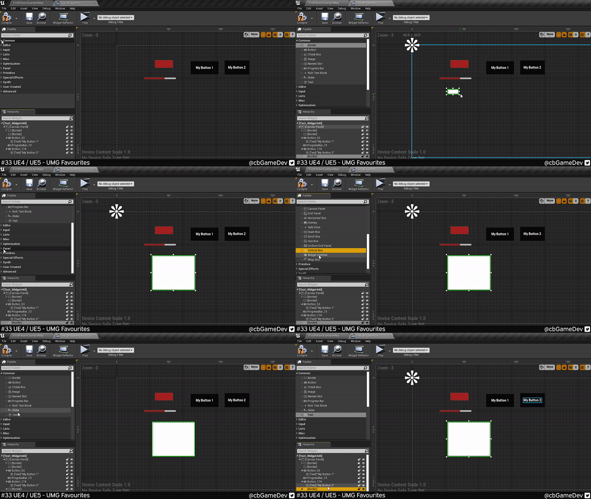
Normally when building a UI in UMG, you have to jump around the palette section opening up the relevant categories, finding the asset type you want, and then dragging it out. This back and forth can be time-consuming when you are working on larger more complex UI.
We can save time using UMG Favourites. Below I am creating the same set of elements, using the favourite systems instead and you can see how much faster it is.
It is very simple to add an item to your favourites. Next to each element in the Palette section you will see a little star.
Clicking on that will create a new section called Favorites, at the top of the list and your element will be added there. The great thing about this is that this section remains at the top constantly, so you are able to quickly access things that you add there.
You can remove something from your favourites by clicking the star next to the element within the “Favorites” section as show below:
The elements that I tend to use a lot and add to my favourites are: Border, Size Box, Text and Vertical Box
This seems to works in the Early Access version of Unreal 5 as well. The only difference is that the stars are hidden until you hover over an element as you can see below.
I do a lot of UI stuff but I only found out about this the other day and now it’s something that I use all the time when I am building out a UI.
If you want more quick tips & tricks FOLLOW ME ON TWITTER @cbGameDev
Also, check out the parkour game I'm solo developing called Freerunners. Give it a wishlist if you like the way it looks!: https://store.steampowered.com/app/1430330/Freerunners/


