QUICK DEV TIP #53 UE4 / UE5 - LIGHT MAP STATISTICS
If you use baked lighting in your levels, this should be a useful one for you!
Did you know you can see a statistical breakdown of your lightmaps?
If you would prefer to watch the video version, check it out here
This is really handy if you are trying to make your level look great but keep it optimised at the same time.
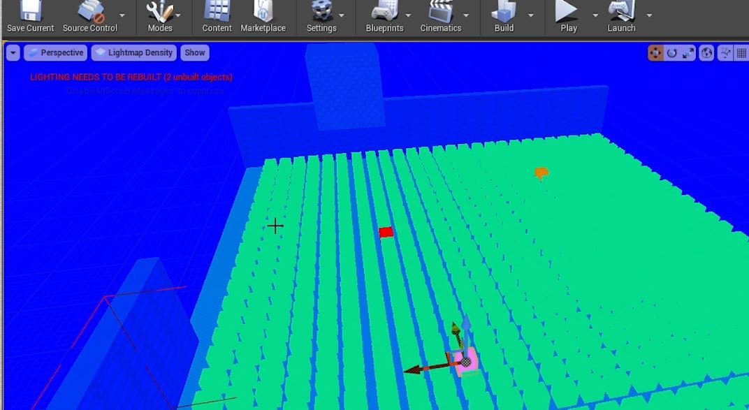
We can get a quick overview of our lightmaps by going up to the top left of the viewport and selecting LIT->Optimisation Viewmodes -> Lightmap Density
This will give us a colourised lightmap view. We can instantly see some potential offenders in terms of lightmaps that are too large for the asset, or too high/low res compared to those surrounding them.
This is a great viewmode, but there are some problems with it. For example, it relies on us being able to see the asset. If an asset is obscured, you might miss it, as demonstrated in the GIF below.
Another way to check your lightmap which compliments the Lightmap Density Viewmode is by using today’s Quick Dev Tip: lightmap statistics. You can access these by going to the little drop-down next to the build button. Then selecting Lighting Info -> Lighting Static Mesh Info.
This will open up a window which has a lot of stats about the lightmaps of the assets in your level.
The parts that I focus on mainly are the Actor and the Resolution, as well as generally how many times something is used in the level. You should know roughly how big an asset is and so you should be able to tell if a resolution is too large, even without looking at the asset. Also, it’s important to remember a large asset can have a high resolution if it’s not used very much and vice versa a small asset/lightmaps can still build up and become expensive if you have a large number of them throughout your level.
A very useful aspect of this is that we can actually click on the asset name to go directly to it so we can do that visual check on it as well, as you can see in the GIF below. I will normally go through the assets with larger resolution lightmaps to just double check that they should be using something the size that they are.
This seems to be exactly the same process in the Early Access Version of Unreal 5. The only differences being with the new UI overhaul.
It’s definitely worth opening up this Lighting Static Mesh Info window every once in a while just to make sure nothing sneaks into your level which could cause you optimisation problems!
Want to know when I release new quick Unreal tips & tricks?
Enjoyed this? Check out my other work:


